| 10210 Systems Parkway, Suite 390 Sacramento, CA 95827 |
|
| cd1@catalinadirect.com | |
| 1-800-959-SAIL (7245) |
Display
The first tab on the product form is for the main display settings. This is where you enter all the text for the product and determine where and how it will be displayed in your store. The settings on this tab include:
- Product ID – This is a system-assigned number for the product. You may need to use it for making direct links to specific products.
- Name – The name of the product as it will be referred to in your store. Used for titles if you are not using graphic images as well.
- Product Category – What type of product this is. The default settings for the type are:
- Physical Product – a normal store product
- Membership – used for selling access keys for site content
- Download – for downloadable software products
- Gift Certificate – used for selling gift certificate codes
- Product Type - Choose the product type in order to enter Specification and Search Parameters in the Info tab specific to this physical product.
- Manufacturer – If you have set up any manufacturers in the Accounts section, you can assign one to the product here. The manufacturer’s logo will be displayed on the product detail page.
- Display – Used to toggle the product on and off in the store.
- Category – The category(s) you wish to display this product in. Products can be assigned to any number of categories, or none at all. In most cases, you will want to assign a category for your product to appear on for normal store browsing. Only categories that have a template type assigned that will accept products will be shown on this list.
- Priority - Used for sorting the products on the subcategory pages. 1 is the highest priority, then 2 and so on down. Use 0 or leave blank for no priority setting (default sort).
- Access Key – You can assign an access key to the product if you want it to be visible only for specific users.
- New – Toggles the product as new.
- Sale – Toggles the product as on sale.
- Hot – Toggles the product as ‘hot’.
- Allow Reviews – Use this to set which products will allow users to add reviews. Generally this is turned off for products types like memberships and gift certificates.
- Content Position: Choose to have the text boxes appear in the right column only (under the buy box) or have it appear full width.
- Gallery Image Style: Choose how the additional product images that appear under the main image are styled - scroll left to right or unorganized.
- Custom Palette – Select the palette to use for this product, by default the palette selected as the default in the Main Settings will be used.
- Parameters – Parameters are used to pass additional settings to your template and can be customized. The default product template has parameters to adjust the text for related products and features and the product image gallery.
- Short Description: The product description to display on the category pages. This text will also be used on the detailed product page if no detailed text is entered. Also used for other pages such as the sitemap and search results.
FULL DESCRIPTION
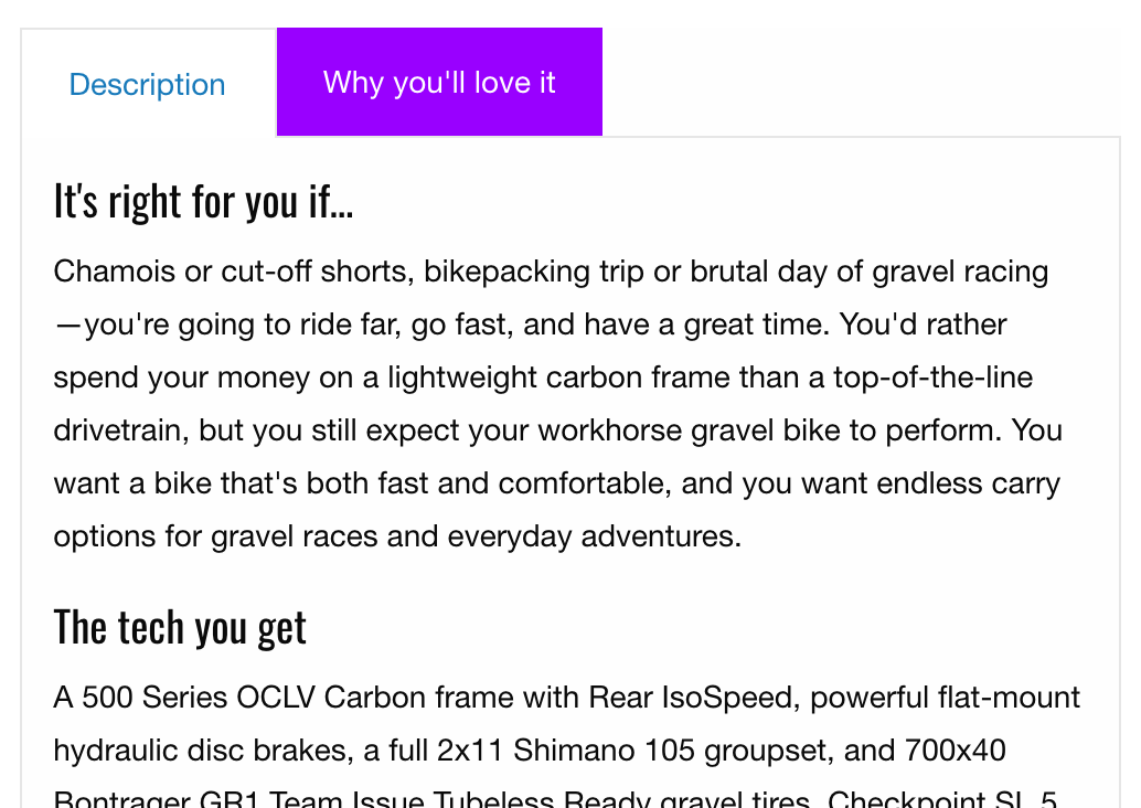
- Show All Tabs / Hide Tabs - When you add a new product, you will see 4 fields labeled 'Tab Title' and 4 text editors.
- If you enter content into multiple text editors, it will create tabs on the product page to hold the information.
- If you fill in the 'Tab Title' field they will used as the tab names.
- If you don't fill in the extra text editors, then they will be hidden from view when you edit the product. You can make them appear by clicking 'Show All Tabs'.

SEO
- HTML Title – Custom text to use as the custom title for this product page, useful for search engine placement.
- Meta Description – A description specific to this product to be used for search engines; otherwise the default description set up in the Main Settings will be used.
- Keywords – Enter the keywords for this product for search engines, if none are entered the store default will be used. The meta description and keywords will also be used for store searches.
